"Typographically-led design."
Collaborative effort celebrating TIMEX history, typography, creativity, and design produces a highly intentional, bespoke Camper with a custom font, "coming from a place of heritage and history."
TIMEX x It's Nice That x Camelot Typefoundry
Hi. This is Alan (contact: email). Here is a review of a really "nice" TIMEX from December 2017.
It's another TIMEX resulting from a collaboration with other enterprises, adding to the thus far short but illustrious legacy of collaborations that were stimulated by the November 2015 release of the Original Camper. This one, though, is not a retail/fashion collaboration, but a collaboration with a London media publishing platform, and a German typography collective. What?
Yes, TIMEX has teamed up with London media publishing platform Its Nice That, and Leipzig-based typefoundry Camelot, to produce this wristwatch. (All photos on this page, unless specified, were taken by myself of my own watch. I took many of them while out on a lunchtime walk in the woods, and found many reflections. Instead of trying to battle the reflections, I decided to just let it go, embrace it actually, and keep them as part of the appearance of the watch in real life.)
Much of the background information for this review was obtained from two articles at the It's Nice That website (article 1, article 2).
It's Nice That, "which exists to enable creativity to thrive," is a media publishing platform operating as website, a magazine, an events organizer, and more, based in Haggerston, East London. Although this project does not appear to be described specifically as an "anniversary" celebration, its release comes ten years after It's Nice That's 2007 founding. Below is a listing of the categories, at It's Nice That.

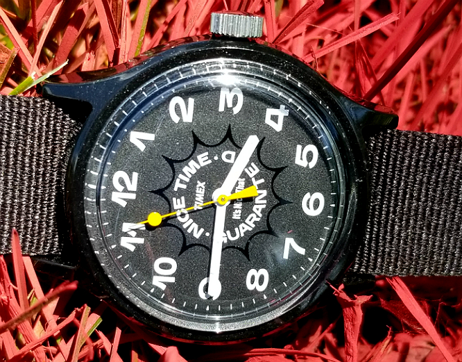
This was not a highly orchestrated or well thought out photo. I was out walking,and saw that the city (gas company?) had spray painted red and blue streaks in the grass. I laid down the watch and took some pics.)
I'd like now to just list some of the basics a bit about the watch, and will return later with more descriptions.
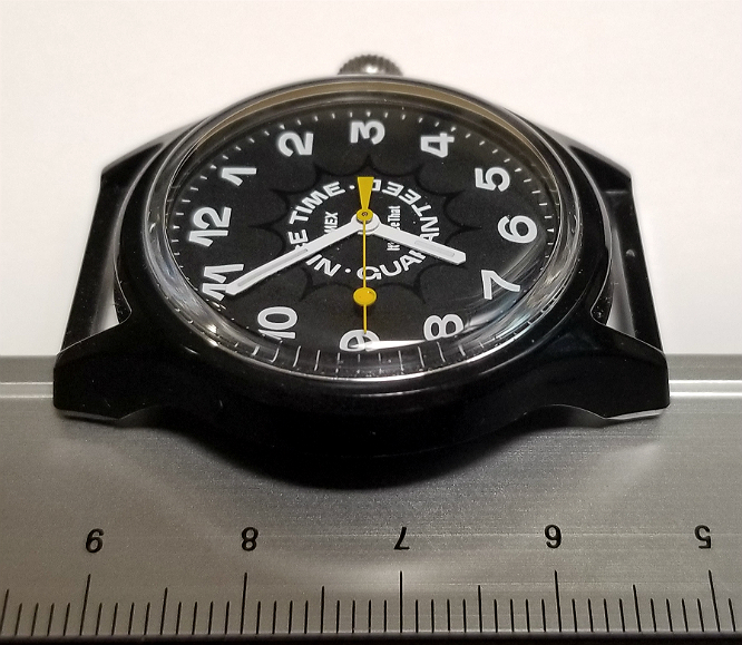
Case diameter: 36 mm
Case color: black
Case composition: resin
Strap: single piece black nylon, with metal buckle and loop/stay
Movement: Japanese quartz
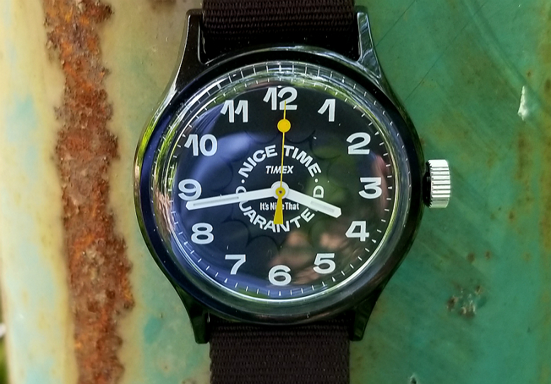
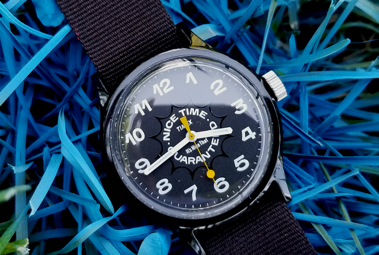
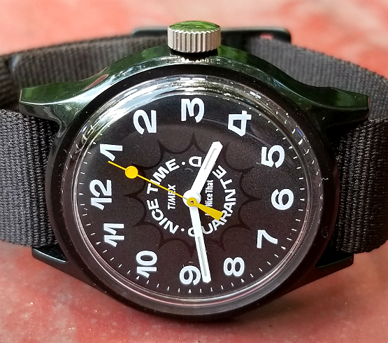
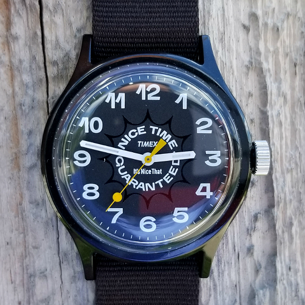
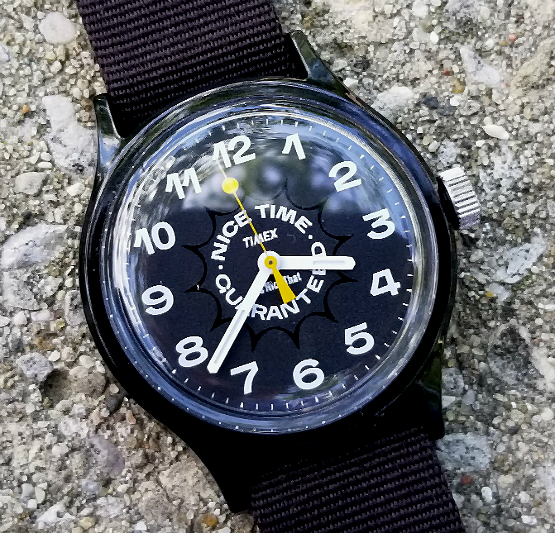
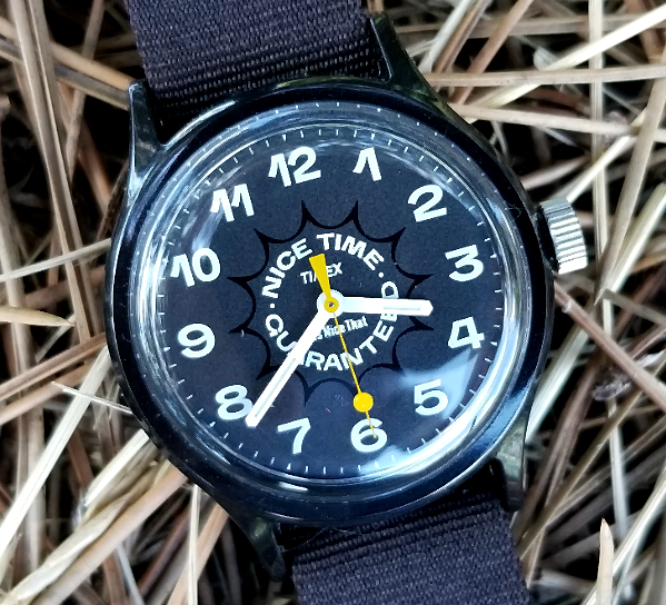
Dial: non-luminous, black and white, mostly matte, with some more glossy areas.
Hour and minute hands: white, with luminous material
Seconds hand: YELLOW!
end/
This gif used courtesy of It's Nice That
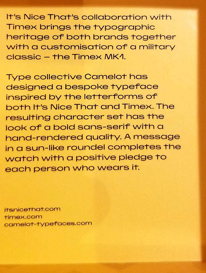
This result of this project is a watch that serves to encapsulate and celebrate, through typography, "prior design histories" of both TIMEX and It's Nice That, partnering with Camelot who created a customized font to enable those goals. Central to this ambitious project was the inclusion, in the custom font, of "both the typographic styles shown on previous Timex watches, and the hand rendered tendencies of It’s Nice That’s in-house design approach." Experts at Camelot pored over decades of TIMEX watches and clocks, analyzing and categorizing the number and letter fonts on the dials. This included many fonts which were hand-drawn, before digitized fonts became available. Camelot, in creating the type, considered quirks that were unique to the hand-drawn nature of the historical fonts, including flicks and brushstrokes.
'As the original Timex lettering was built of "simple geometric shapes," the foundry used it as a framework to build "a lively and distinct character," in details as delicate as the extended flick of the number one on the watch face. "It was a great joy to almost cartoonize the numbering so that each number became an individual by itself."'
This image used courtesy of It's Nice That
During development, Camelot also considered "the loud and interesting typography that was applied to sell products starting in the heyday of American advertising." The letter component of the resulting custom font utilizes only capital letters, as this facilitated proper spacing in tight quarters over a mix of upper and lower case. A bold sans serif font, with a hand rendered quality:
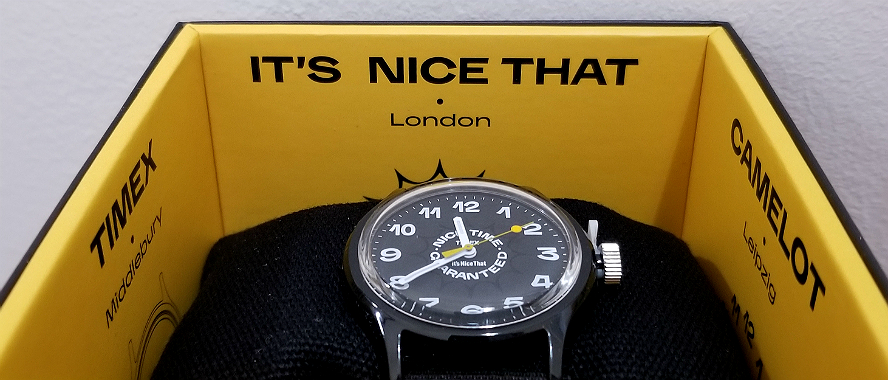
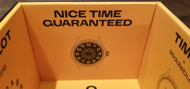
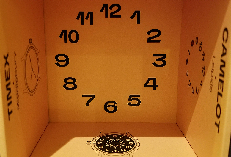
Above, from the inside of the box. Let me talk for a moment about the box. The box is really beautiful. It has two square-face parts that come together to enclose a black pillow, which the watch is strapped around. Around the four inside walls of the box are tributes to TIMEX, It's Nice That, Camelot and the slogan adopted for this project, "NICE TIME GUARANTEED.
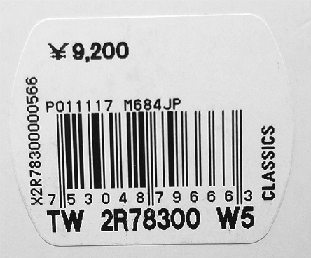
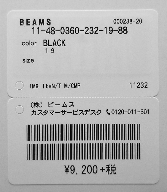
This watch was purchased from BEAMS, in Japan. Retain price 9,200 yen.
The watch sold through timex UK, timex US, BEAMS, Goodhood and End Clothing (both UK).
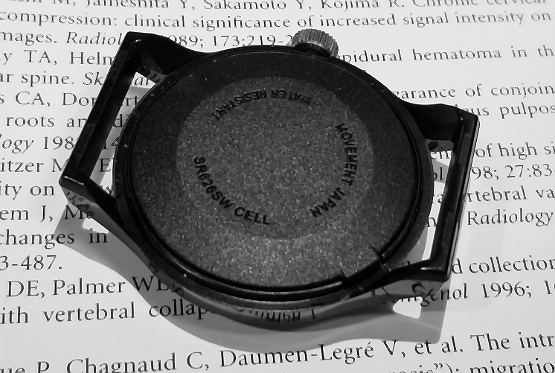
Above, a good view of the fixed-lugs case. Unlike the mechanical Camper Watch which had no caseback, the quartz Campers have a removable caseback for changing out the battery. You can see the little lip for lifting off the back, lower right.
The design team chose (wisely, I think) the "Original Camper" watch as the "base model" for the project. (This watch line is also called MK-1, but given that the original consumer mechanical watch in the 1980s and 1990s was called the Camper Watch, and that the revitalization of that watch after a 25 yr absence by TIMEX Japan was named Original Camper, I will refer to it as a Camper.
The Camper, and therefore this watch, can trace its origins to a US Government "field watch" specifications document from October 1964. Much has been written about the history of these original watches, the consumer counterpart sold by TIMEX, and the subsequent resurrection of the Camper after a 25 year absence from the TIMEX catalogs, so I won't replicate all that here. If interested, here are a few links:
1. Mechanical Camper Watch: the original mechanical watch modified from the government prototype, made for the consumer market. 1980s-1990s.
2. Original Camper November 2015. Review, and origin stories of the Camper resurrection, by TIMEX Japan.
3. Index page to reviews of all my Camper watches, 1987-2018.
Minute and hour hands have light-activated luminous material.
Bottom of the box.
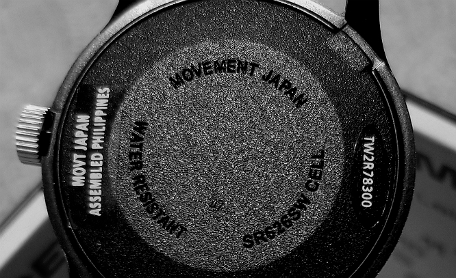
Removable stickers on the caseback indicating the model number TW2R78300, the presence of a Japanese movement, and assembly in Philippines. Molded into the caseback are the battery replacement number, WATER RESISTANT, and MOVEMENT JAPAN. You can barely see 47 in the lower part of the picture, corresponding to manufacture in December 2017.
Using the same bespoke font developed by Camelot for the watch, the box has NICE written along the sides of the outer box, and along the sides of the inner box is written TIME. I won't picture every letter, but you can get the idea. The box is matte black, and the letters are in a slightly glossy black. (The box is really great.)
Why is the Camper such a great choice for this collaborative project? Firstly, before considering the design, the 36 mm size is kind of like the "perfect size" for a watch, to me. I don't mean that a smaller or a larger watch is unacceptable to wear. But it is of a size that most adults probably would not say that it is necessarily either too small or too big for them. I would even argue that you could not say it's too large or small. You may prefer, in general, watches larger or smaller, but if you were otherwise happy with the design of a particular watch, and that watch is 36 mm, you almost cannot say "I can't wear that."
Next, the Camper design is "simple" in that it is free of decorative flourishes, maybe even "Modernist" in appearance, and provides an excellent template upon with a bespoke design can be created. By lacking significant decorative features, the Camper "base model" would have a hard time creating any kind of disharmony with any custom applied design.
Looking into the bottom of the box.
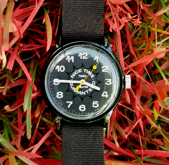
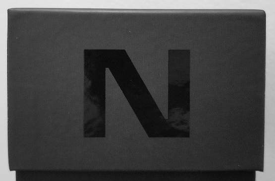
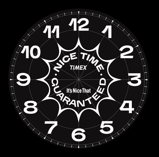
Image courtesy of It's Nice That
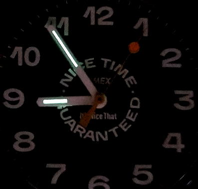
Returning to the dial design. Above is what appears to be the final design drawing. It was the result of considerable "back and forth" consultation between Camelot and It's Nice That, to achieve a coherent final result. This included making the numbers as the dominant feature at the periphery of the dial, instead of the originally planned words (NICE TIME GUARANTEED.) The constraints of dial size and geometry created challenges, as did considerations of the omnipresent, overlying hands, and the distorting effects of a curved crystal. Looks pretty good. In the above diagram, you can see how the font is influenced by the hand-drawn qualities of pre-digital fonts, and can almost imagine a wide nib calligraphy pen, or even a flat/angled black marker drawing the numbers and the NICE TIME pledge.
The elongated flick of the 1 is particularly fun and whimsical, and reminds me of the way Europeans make their 1, compared to the more straight up-and-down "stick" of the American 1. Notice the flick in the 1 of 10, 11 and 12 is at a steeper angle than the one at 1 o'clock, to allow for a less wider numeral 1, and all all numbers to be a uniform width. I also enjoy the tiny "arrowhead" marker, every 5 minutes/seconds, at the edge of the dial, interrupting the monotony of the regular hashes. Notice that TIMEX and It's Nice That have retained their usual logos, without the bespoke font being applied.
I need to talk about the yellow seconds hand. I think it's really great that they made it yellow. The standard seconds hand on the Camper is white, which works fine. And this watch would have been perfectly fine with a white hand. But making it yellow breaks up some of the "monotony" of an otherwise black & white dial, and adds a little bit of fun and whimsy. This may be overinterpretation, but you could even say the yellow hand "tones with the sunshine" of the 12-pointed sun roundel that surrounds the words at the center.
Beyond this, the yellow hands is part of TIMEX history. While the mechanical Camper Watch of the 1980s generally had a white hands, there were versions (limited editions?) of the Camper with yellow, red and possibly even green seconds hand. I have the yellow one, and the red one. So, I think this makes the yellow hand doubly good.
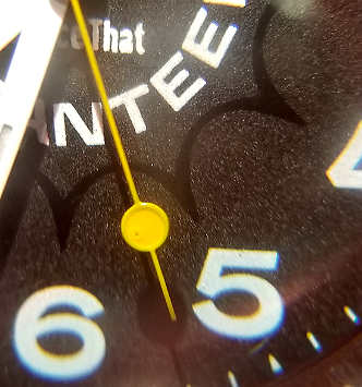
Here, in direct sunlight, you can appreciate the slightly granular, matte appearance of most of the dial, and how the "sun" roundel is more glossy.
Also, what about that sun?
And also we really have not really talked much about the NICE TIME GUARANTEED pledge. This pledge is designed to bring the design ethos of It's Nice That into this watch. It is probably best explained by the creative directors, in this article. Well, the sun roundel is symbolic, and can seen as "a visual representation of time passing," day/night cycle etc, but also as an acknowledgement of the historical method for telling time with a sundial. The shining sun is also of course well-known as a mood elevator, an icon of cheerfulness and of general "nice times," as universally recognized from nursery onward. Implemented by the design team "to bring something irregular and sunny into the design.”
In summary, here is a meticulously-designed, highly intentional, but also fun and whimsical Camper collaboration between TIMEX, and design / creativity interests. With a unified focus on typography, bringing in elements of corporate and advertising history, and of course NICE TIMES. From a functional point of view, it has a high-contrast, highly readable dial / hands combination, and is visually very pleasing to look at. Did I mention it has a yellow seconds hand?
Thank you for reading. I hope you will like it.
Alan
Contact: